

The Brief
The Brief
away is a new-age co-working space in Bangalore, created as an extension of the Kolkata-based East India Works entity. With plans to scale to different cities, the founder was looking to establish a fresh umbrella brand—one that would carry its own voice, identity, and visual system with a subtle nod to its origins.
Our task: Shape this new brand from the ground up: name, narrative, look & feel across spaces, screens, and surfaces. The outcome? A 150+ page brand book.
The Challenge
The Challenge
While East India Works had an established presence, away needed to stand on its own. The real challenge was to build a new identity on top of something existing—ensuring differentiation without dissonance. The project was as much about being a decision partner as it was about being a design partner. And that’s what made this project exciting. Through multiple workshops & discussions, we waded through references, mood boards and spent a considerable amount of time developing more than 10 options for the logo. With opinions flowing in from family, friends, colleagues, and strangers, the team stepped up to help reach a conclusion that felt convincing and was the need of the hour given the pace of the project.
While East India Works had an established presence, away needed to stand on its own. The real challenge was to build a new identity on top of something existing—ensuring differentiation without dissonance. The project was as much about being a decision partner as it was about being a design partner. And that’s what made this project exciting. Through multiple workshops & discussions, we waded through references, mood boards and spent a considerable amount of time developing more than 10 options for the logo. With opinions flowing in from family, friends, colleagues, and strangers, the team stepped up to help reach a conclusion that felt convincing and was the need of the hour given the pace of the project.
The Approach
The Approach
Naming & Narrative: It started with a list of options ranging from canopy to hub, and away was a part of it. The founder is a quirky personality, not the average corporate professional, and we wanted that to reflect in the name and the space. We picked “away” to create a feeling of detachment from the ordinary, a mental and physical shift to a calmer, more inspiring workspace. Effectively, away was “a soft rebellion against the chaos of work.”
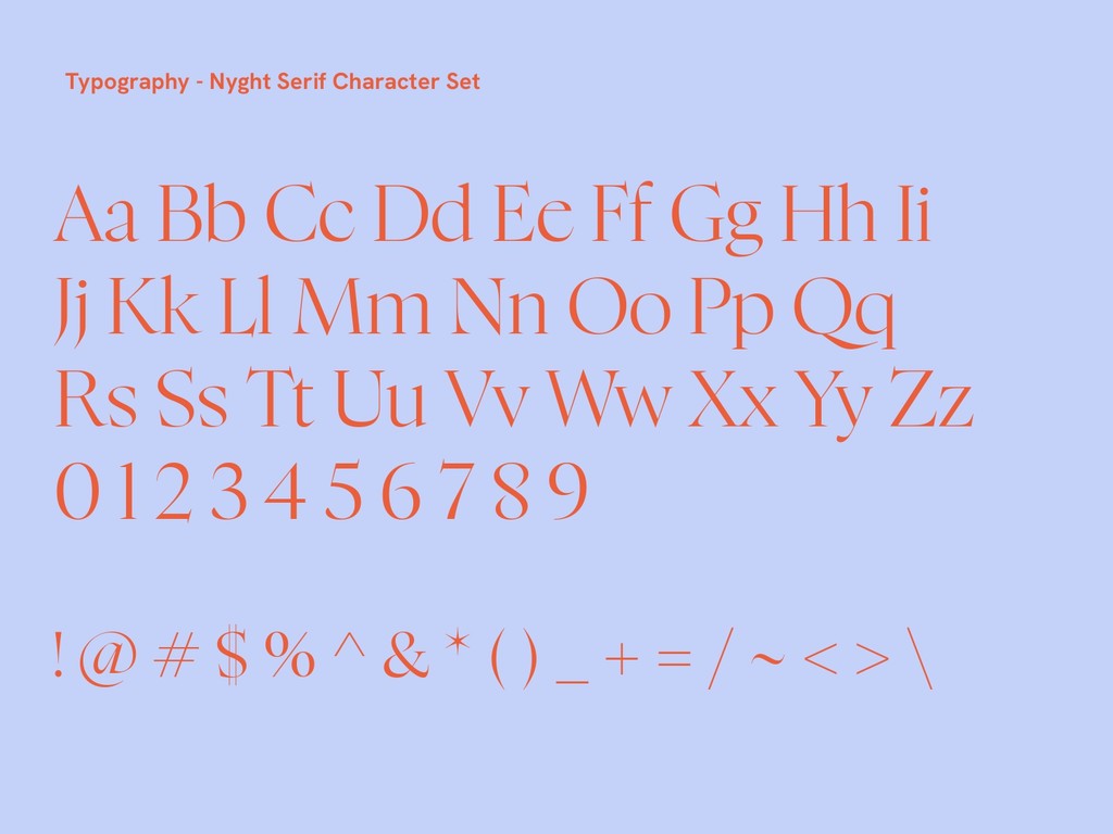
Visual Identity: A minimal, clean, font-based logo where all the letters follow the same style and the “w” stands out, going “away” from the norm. The typography choices were also thought through with multiple rounds of discussions and samples created until we were convinced on X and Y.
Color Palette: We wanted to be bright and stand out, and yet we needed to be professional. We were designing not just for a digital presence but also a physical space. The final choice of color palettes reflects exactly that. With the orange as the hero ensuring we grab attention and the teal as a suitable secondary color practical for walls & steel fittings. Accent colors added versatility without overwhelming the base identity.
Naming & Narrative: It started with a list of options ranging from canopy to hub, and away was a part of it. The founder is a quirky personality, not the average corporate professional, and we wanted that to reflect in the name and the space. We picked “away” to create a feeling of detachment from the ordinary, a mental and physical shift to a calmer, more inspiring workspace. Effectively, away was “a soft rebellion against the chaos of work.”
Visual Identity: A minimal, clean, font-based logo where all the letters follow the same style and the “w” stands out, going “away” from the norm. The typography choices were also thought through with multiple rounds of discussions and samples created until we were convinced on X and Y.
Color Palette: We wanted to be bright and stand out, and yet we needed to be professional. We were designing not just for a digital presence but also a physical space. The final choice of color palettes reflects exactly that. With the orange as the hero ensuring we grab attention and the teal as a suitable secondary color practical for walls & steel fittings. Accent colors added versatility without overwhelming the base identity.


Brand Mockups: Now this is where things got super fun. To demonstrate the applications of the brand identity, we created mock-ups for every possible marketing asset, ranging from social media templates to walls and elevator/washroom signage, merchandise like tote bags or t-shirts and even an onboarding kit. Each piece had specific content suitable for that asset and a design that helped visualize the brand not just as a concept but as a lived space.
Brand Mockups: Now this is where things got super fun. To demonstrate the applications of the brand identity, we created mock-ups for every possible marketing asset, ranging from social media templates to walls and elevator/washroom signage, merchandise like tote bags or t-shirts and even an onboarding kit. Each piece had specific content suitable for that asset and a design that helped visualize the brand not just as a concept but as a lived space.


Illustration Style: A full section was dedicated to 10 custom illustrations that reflect the idea of away being a brand where it’s about work and play. Someone balancing a coffee mug on a stack of papers, doing yoga while attending a work call, or late-night meetings with scattered pizza boxes—the illustrations reflect everyday co-working moments and were then adapted onto brand assets.
Illustration Style: A full section was dedicated to 10 custom illustrations that reflect the idea of away being a brand where it’s about work and play. Someone balancing a coffee mug on a stack of papers, doing yoga while attending a work call, or late-night meetings with scattered pizza boxes—the illustrations reflect everyday co-working moments and were then adapted onto brand assets.


The Outcome
The Outcome
Design Collaboration: We worked closely with graphic designer Soumya Kalapa, whose design sensibilities played a crucial role in translating ideas into visuals. And a shoutout to Anjitha KV for absolutely hitting the brief on illustrations.
Design Collaboration: We worked closely with graphic designer Soumya Kalapa, whose design sensibilities played a crucial role in translating ideas into visuals. And a shoutout to Anjitha KV for absolutely hitting the brief on illustrations.
What’s Next?
What’s Next?
With the brand foundation firmly in place, away is now gearing up to bring its physical space to life. With a website in the works and interiors getting built, the brand is in the process of launching officially, and we’re excited to see this identity take shape in the real world.
With the brand foundation firmly in place, away is now gearing up to bring its physical space to life. With a website in the works and interiors getting built, the brand is in the process of launching officially, and we’re excited to see this identity take shape in the real world.
The Pipal
The Pipal
Soumya - Designer
Anjitha - Illustrator
Soumya - Designer
Anjitha - Illustrator

Let's bring your vision to life.
Let's bring your vision to life.